Colour is a powerful method of communication. It can be used to signal action, affect people emotionally and psychologically, and even cause physiological reactions. This is because colours all have well-established meaning associated with them; something that film has made use of for decades. In film, colour is often the tool used to convey symbolic and emotional meaning. It can be used to set the tone, show character traits or establish links between things (Verstraten translated by Lecq 2009).
When looking at using colour as a method of communication, it is important to remember that the meanings associated with colours are cultural, not universal. This means it is important to think about who the target audience is and what associations their culture has with a specific colour. An example of this is the colour red. In the West red is associated with love but also danger and anger; in the east, however, it is primarily associated with success and fortune. Depending on where a game is made, the colour associated with them could mean different thing than you expect.
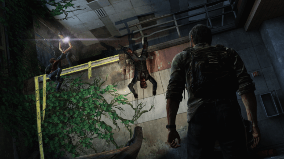
In games colour is most often used to draw a players eye to important objects, such as how Naughty Dog uses the colour yellow to make players aware of interactable objects (fig. 1.). if you wan to make an object standout then use a colour that doesn’t quite belong within the wider colour scheme.
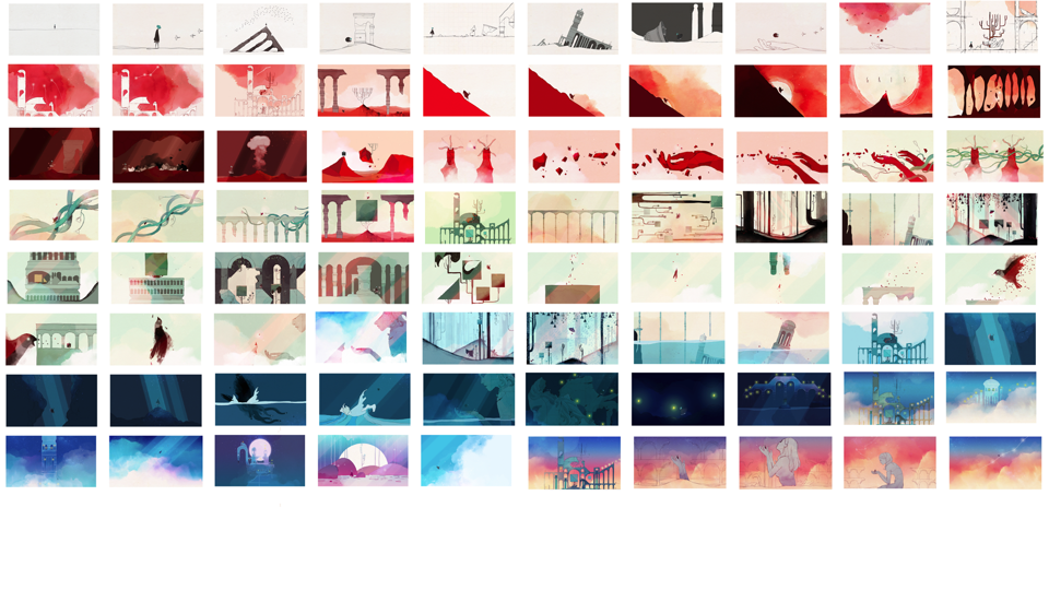
As in films, games can also use colours and their associated meanings to convey specific emotions, set the tone and draw attention to important details. Journey (2012) and Gris (2018), are two games that do this particularly well. Both games that utilise a wordless narrative, instead relying on the player to discover the story by travelling through the games world. Both Journey and Gris uses colour to convey specific emotions and moods to the player, with Journey using colour to specifically represent the transition between different stages of life (fig. 2.).
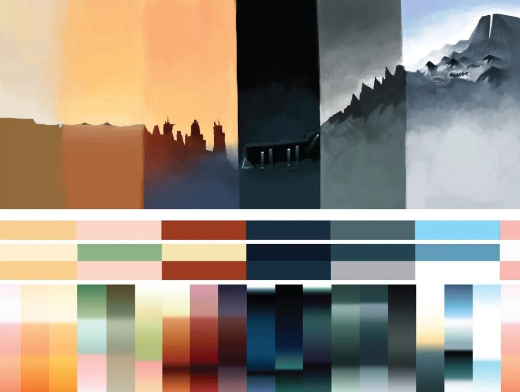
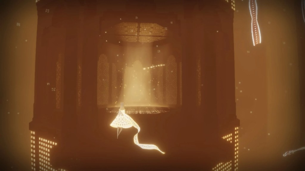
Each level of the game conveys a different mood or feeling to the player. During the levels spent crossing the desert the colour orange creates the feeling of mystery and happiness as the player is free to explore the environment and go where they like (fig. 3.). Later the player is plunged downwards into a dark, murky green environment and the excitement it abruptly changed to dread as you enter the confined space of the underwater level. The overall mood of the level is one of danger and caution and is backed up by the environment which is dark and restrictive of the player movements, the stage represent the struggles of transitioning from childhood to adulthood (fig. 4.). The end mood of this level though is one of hope; having escaped the guardians chasing you the player travels upwards, bathed in warm orange glow reminiscent of the earlier levels (fig. 5.). When the player is travelling up the mountain the white of the snow and the harsh lighting and landscape creating a feeling of despair and represent the end stage of life (fig. 6.) and then rebirth as the character walks into the light and cycle begins again as the player is returned back to the start (fig. 7.).


Gris on the other hand uses colour to represent the five stages of grief from the Kübler-Ross model. The lack of colour in the first section represents Denial (fig. 8.), with Anger (fig. 9.) being represented by red, Bargaining (fig. 10.) by green, Depression (fig. 11.)n by blue and Acceptance(fig. 12.) by yellow . Fear takes the form of a giant bird in the game and is represent by the colour black (fig. 13.), with the colour black, and the associated fear, being a major component of the levels until Gris gets to the acceptance stage (fig. 14.).


The level through out Gris, don’t just feature one colour, when you move to the next stage the colour form the stage before is still present. This represents that grief is not just a linear process and that the stages of grief happened in different orders with setbacks to overcome.
Journey and Gris are both excellent example of how games don’t need words to tell a story and that colour is just as suitable a method for conveying a narrative to an audience as more obvious methods of communication.
“Colour is a power which directly influences the soul.”
Wassily Kandinsky
References:
VERSTRATEN, Peter. translated by Steven van de LECQ. 2009. Film Narratology. Toronto: University of Toronto Press
Games:
Gris. 2018. Nomada Studio, Devolver Digital.
Journey. 2012. Thatgamecompany, Sony Interactive Entertainment.
The Last of Us: REMASTERED. 2014. Naughty Dog, Sony Interactive Entertainment.
Figures:
Figure 1. The Last of Us: REMASTERED. 2014. Naughty Dog, Sony Interactive Entertainment.
Figure 2. Colour script from the development of Journey (2012)
Figure 3. Journey. 2012. Thatgamecompany, Sony Interactive Entertainment.
Figure 4. Journey. 2012. Thatgamecompany, Sony Interactive Entertainment.
Figure 5. Journey. 2012. Thatgamecompany, Sony Interactive Entertainment.
Figure 6. Journey. 2012. Thatgamecompany, Sony Interactive Entertainment.
Figure 7. Journey. 2012. Thatgamecompany, Sony Interactive Entertainment.
Figure 8. Gris. 2018. Nomada Studio, Devolver Digital.
Figure 9. Gris. 2018. Nomada Studio, Devolver Digital.
Figure 10. Gris. 2018. Nomada Studio, Devolver Digital.
Figure 11. Gris. 2018. Nomada Studio, Devolver Digital.
Figure 12. Gris. 2018. Nomada Studio, Devolver Digital.
Figure 13. Gris. 2018. Nomada Studio, Devolver Digital.
Figure 14. Art work from the development of Gris (2018)

Leave a comment